Optical, which began as Tyler Hawkins’ undergrad thesis at Emily Carr University, allows users to customize punctuation size, spacing, boldness and more
Since reading and writing went from the page to the screen, you’d think it’s become more accessible. But as this global report by the World Health Organization reveals, 2.2 billion people currently live with impaired vision, making legibility a very real problem.
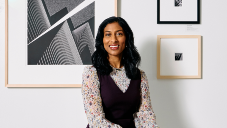
Tyler Hawkins, a designer who developed a font for low vision called Optical, thinks the alphabet was made for paper, not screens. “There are ways that we can improve it,” the recent graduate of Emily Carr University of Art + Design tells BCBusiness. “The ultimate goal is to help evaluate how we talk and think about the written word.”
Optical is built on new font technology that improves legibility control. Available as a Google Chrome browser extension, the tool lets you to customize the base font designed for low vision and make incremental adjustments to features like letter style, punctuation size, spacing, boldness and more.
The project was developed with support from various stakeholders, including the Accessible Technology Program operated by Innovation, Science and Economic Development Canada and the Health Design Lab and Shumka Centre for Creative Entrepreneurship at Emily Carr University. The Disability Alliance BC helped to coordinate three rounds of feedback from the low-vision community as well as from experts such as optometrists and the Advanced Reading Technologies team at Microsoft Corp.
“One example is an early conversation with someone with low vision,” Hawkins says. “She’s a low-vision advocate in the Lower Mainland—she works to help inform municipalities to build spaces and buildings to be better equipped for people with low vision. Initially, we focused on other font legibility techniques, and she was like, You really need to focus on boldness as well; it has a huge impact for me, and I can really see benefit from that. So we did.”
READ MORE: 30 Under 30: Serial entrepreneur Thamer Matar is out to create more-accessible workplaces
Growing up in Vermont, Hawkins was inspired by the design work of Burton Snowboards. He gradually built a freelance business himself, working for companies like advertising and marketing giant Ogilvy before attending Emily Carr University to pursue a degree in communication design. His experiences as a designer fed his interest in letters and accessibility, so when time came for his undergrad thesis, he did an eight-month deep dive into the topic. The result was the prototype for Optical.
“[I was] curious about the limitations of the work that we’re doing,” Hawkins says. “The limitations of the internet, how we’re making websites or how we’re presenting things. Everyone’s vision is unique, and computers kind of tailor things to everyone better than you could ever do with paper.”