1924s_paris.jpg
1924 Summer Olympic Games – Paris, France
[pagebreak]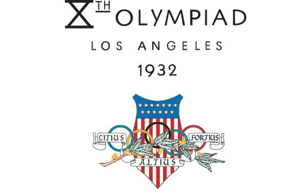
1932 Summer Olympic Games – Los Angeles, U.S.A.
[pagebreak]
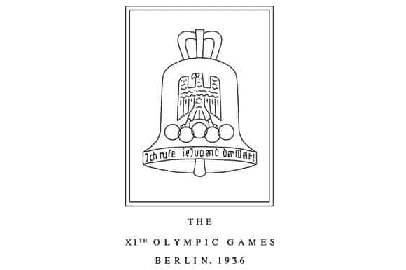
1936 Summer Olympic Games – Berlin, Germany
[pagebreak]
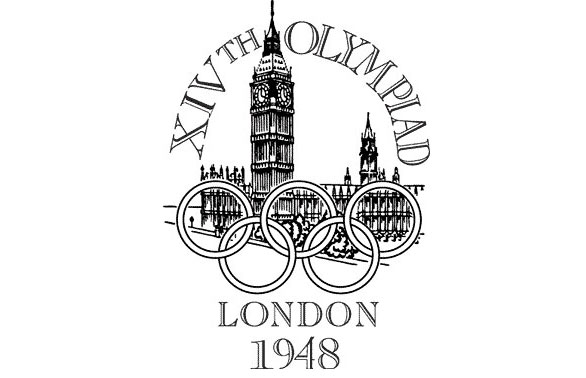
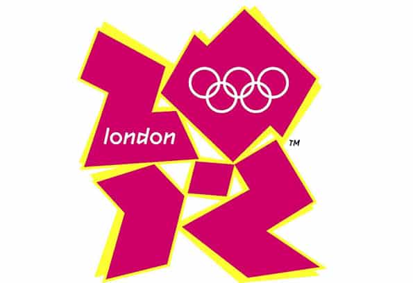
1948 Summer Olympic Games – London, Great Britain
[pagebreak]
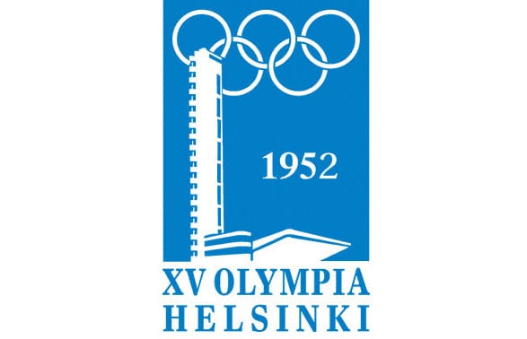
1952 Summer Olympic Games – Helsinki, Finland
[pagebreak]
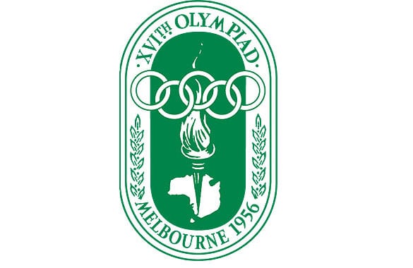
1956 Summer Olympic Games – Melbourne, Australia
[pagebreak]
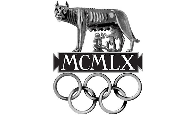
1960 Summer Olympic Games – Rome, Italy
[pagebreak]
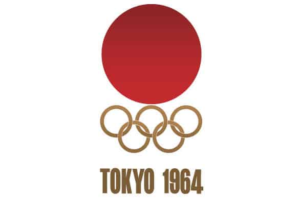
1964 Summer Olympic Games – Tokyo, Japan
Tokyo 1964 wins the gold for minimalizm, with its entry of a great cicrle over the Olympic rings, rendered in gold.
[pagebreak]

1968 Summer Olympic Games – Mexico City, Mexico
Top honors for psychedelic yumminess go to Mexico 1968, which embraced the percepts of op art to full dizzying effect.
[pagebreak]
1972 Summer Olympic Games – Munich, Germany
[pagebreak]
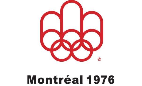
1976 Summer Olympic Games – Montreal, Canada
Call me a jingoist, but the Montreal Olympic logo from 1976 is one of the best. It shows the rings of the Olympic logo moving toward each other, reinforcing the unity and the brotherhood of nations that the Games are meant to promote. Well done Montreal. (Is there a best in show award I can hand out?)
[pagebreak]
1980 Summer Olympic Games – Moscow, USSR
[pagebreak]
1984Summer Olympic Games – Los Angeles, USA
1988 Summer Olympic Games – Seoul, South Korea
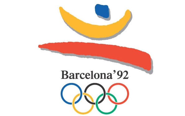
1992 Summer Olympic Games – Barcelona, Spain
The 1992 Games in Barcelona have a Matisse-like quality to them (during his ripped-up-construction-paper phase) that roughly suggest a man in forward motion in a very Spanish palette. I like this one a lot.
1996 Summer Olympic Games – Atlanta, USA
2000 Summer Olympic Games – Sydney, Australia
2004 Summer Olympic Games – Athens, Greece
[pagebreak]

2008 Summer Olympic Games – Beijing, China
[pagebreak]