
The branding of the 2010 Games – and a look back at the hits and misses of Olympic logos past.
(More: Vancouver 2010: The Business of the Games.)
In this consumerist society of ours, it’s impossible to escape the overwhelming presence of logos. Their ubiquity forms a sort of wallpaper, with countless brands plastered across the daily landscape competing for our attention.
A good logo not only stands apart from that crowd; it also effectively represents, in graphic form, the essential elements of a brand. It’s the brand’s flag, capturing all the feelings and experiences that a company or organization bundles together to form its persona.
This month we will be inundated with logos, and none will be more prominent than the official logo for the 2010 Winter Games. Olympic logos are particularly tricky to get right, as they need to acknowledge the robust history of all previous Games, transmit something unique and fresh about the host city, take advantage of all the personal experiences and memories of a wide array of audiences, and, most awfully, be approved by enough committees to make even the most hardened bureaucrat shiver.
Olympic logos face a high degree of scrutiny and are often held up for derision. Vancouver’s experience has been no different.
We all heard the mumbly grumbly when our 2010 logo was first unveiled back in April 2005. Among the complaints raised, the most resonant for me was that there are no Inuit here, so why choose the Inukshuk (or, to be more precise, an inunnguaq, the Inukshuk’s personified form). Instead of this northern symbol – a cairn, representing a human figure, used by the arctic peoples to navigate and mark special places – why not use a symbol that means something to our own First Nations people? Or something that means something to all British Columbians? Surely we could have found a symbol that had its roots here, where the Olympics are actually being staged.
[pagebreak]
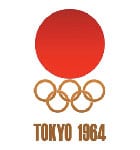 Tokyo ’64 wins gold for minimalism.
 Top honours for psychedelic yumminess go to Mexico 1968, which embraced the precepts of op art to full dizzying effect.
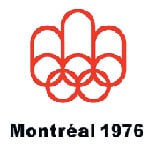
Call me a jingoist, but Montreal’s ’76 logo wins best in show. It reinforces the unity and brotherhood of nations that the Games are meant to promote. Well done, Montreal.
But the decision was made, so then the next step was to retrofit a story around the chosen symbol. This is a time-honoured tradition taught in graphic design school: no matter how powerful or interesting or eye-catching a logo is, it has to have layers and layers of meaning for the text-based left-brainers who may be responsible for choosing it. Layering on a good story is especially smart when you know in advance that a committee will have a say in the final work.
With the Olympics, there were likely entire flocks of committees, so a real ripping yarn was essential. Imagine what a committee would have done with the logos for Nike (What’s that then? A bloody check mark?), Google (Can you make it look more searchy?) or McDonald’s (Maybe the M could be made of french fries?).
In Vancouver’s case, the rationalization process began by assigning various body parts of the anthropomorphic Inukshuk with specific colours, making the whole thing look rather like a butcher’s map showing cuts of beef on the outline of a cow.
Blue was a no-brainer: it stands for ocean and sky. In fact, blue was such a popular choice they used two different kinds, light and dark. The green stands for forests, while the red, we’re told, is for the maple leaf. That left one colour remaining. What’s the one other most-important thing besides maple leaves, water, trees and sky that we need to include? The one vital piece of our national, provincial and civic cultures that ought to make the final cut into the ultimate symbol that stands for everything we live and strive for? Sunsets, of course.
Enter yellow.
So, world, there you have it: something borrowed and something blue – and red and green and yellow. For those unjaundiced foreign eyes who come upon our 2010 logo for the first time this month, what will they see? They’ll see a happy, vibrant, colourful thingy that kind of looks like a person. The more worldly among them may know it’s an Inukshuk, and that Inukshuk dot the Canadian north, which is wintry.
In terms of a lasting impression of the global kind, our Games will have this vibrant, wintry northern happiness attached to the brand. And that’s not all bad.
[pagebreak]
A Look Back
Not bad, but have other host cities done better? In preparing this survey, I looked back at the Olympic logos going back to the very beginning: 1896 in Athens. If you have time one day, do a quick Google search and check out the logo lineage. It’s a great way to see the history of graphic design and communication played out in front of you.
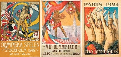
Notable are the efforts of the design team from Stockholm 1912, who win a gold medal for homoeroticism. Silver and bronze in that category go to Paris 1924 and Antwerp 1920, respectively.
Next up: London 2012
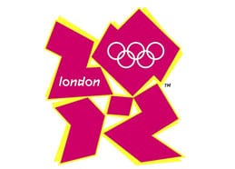
In 2012 London will host the world, and of course that logo is already in high rotation. The British effort, to my mind, resembles those games we used to play with plastic squares and triangles when we were kids.
It’s a very messy design – a stack of chunks, all hard edges and pointy corners – which, when combined (assuming you’re told to look for it), could be interpreted as the numbers “2012.”
Some critics have also seen other things (it’s like looking for pictures in cloud formations) including lewd sex acts and a swastika.

The ’92 Games logo has a Matisse-like quality that roughly suggests a man in forward motion in a very Spanish palette. I like this one a lot.

The 2008 logo had a lot of thoughtful artistry, with reference to scrolls, language, the host city, history, culture and motion. They got the story-layers requirement right.
The official colours for the logo are green, magenta and blue (this explains so much about British interior design), but in order to allow everyone to have some fun, the colours are not set in stone. At least three sponsors have been authorized to change the logo to match their own corporate colours: Lloyds, TSB and Adidas. More adventures in British colour theory are sure to ensue.
The 2010 Verdict
Reviewing all that dross (as well as the few shining exceptions), it made me reconsider my initial discomfort with our 2010 logo. The more I compared the Inukshuk to other Olympic efforts, the more respect I came to have for our colourful little icon. Yes, it’s not really “us.” It doesn’t say Vancouver, or B.C., in any clear or meaningful way. But it’s clean, simple and bright – and it does say winter, if you know what an Inukshuk is.
If I were to go to the graphic designers at my company (We do logos. Hello Rio? Is that you calling?) with the creative brief to design a logo that could stand as the next symbolic iteration of the Olympic movement – one that could embody all that history, pride, dedication and human achievement – my team would be so excited they’d fall over in a dead faint. I have to assume this to be true of any logo designer; there is so much material to work with, so many sources of inspiration and so much emotional capital to use.
Still, the whole process leaves me with one big question: why are the Olympic logo archives so uninspiring?
Perhaps the brief is ultimately too awe-inspiring and there is too much to work with. Or perhaps, and I suspect this is indeed the case, the meat grinder of the committee approval process makes the creation of an inspirational symbol nearly impossible. The goal of the Olympic movement may be “to contribute to building a peaceful and better world,” but the goal of picking an Olympic logo, it would appear, is simply to not offend.
David Allison is a partner at Braun/Allison Inc., a marketing campaign company that has designed more than its fair share of logos. He writes a weekly blog for BCBusiness called One Brand Clapping and can be found online at braunallison.com


